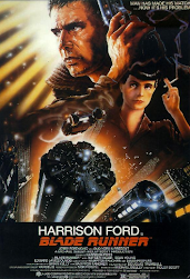
media film poster work

 This film poster connotes a strong sci-fi atmosphere showcasing a very futuristic atmosphere. The main character's name is the same size font as the title which conveys that the film producers are selling the film using his name as he is a successful actor. The production of this poster is very good as it shows the main character looking serious as he is about to fight. The misc-en-scene of Harrison Ford connotes the act as he is about to save the world against robots which are created by man which further connotes in the quote "man has made his match... now it's his problem". The use of Bold text throughout the whole poster shows as if the situation is urgent and shows by Harrison Ford's face this is a serious and urgent matter. The target audience for this film would be teenagers interested in sci-fi action movies about saving the world and putting things right in this Neo-noir film. Just from the film poster i can infer the message of the movie would be that it would be wrong to enslave prototypes as they could use the things taught to this against you causing the main character Harrison Ford to save the world from Robots create by man.


Scary Movie 2 is a comedic parody horror film of movies such as The Haunting, Stigmata, The Exorcist, The Rocky Horror Picture Show, The Amityville Horror, Poltergeist, and The Legend of Hell House. The target audience for the film would be young adults and teenagers and this movie is a hybrid that highlights the contrast between the use of the capitalisation of the word "SCARY" however the characters look more concerned and surprised than scared. The use of the quote "Absolutely Hilarious" clearly shows the contrast as a successful hybrid film as it is meant to have the audience feeling scared and left not knowing what is going to happen next and that is all part of horror films because a successful horror film builds tension at a fast rate leaves the audience with a large amount of suspense. The quote " More Merciless. More shameless" connotes a Strong feeling of no mercy and I presume that would be for the characters and that they are shown no mercy. The contrast in themes juxtaposes the title as it is meant to be comedic but comedy and horror don't go together.

The depressing and melancholy mood created by this film poster gives us a true insight and taster of the upcoming events. I can infer that this is either set in the industrial revolution or a war-secreted atmosphere. The Set is mysterious which is further proved and connoted through the misc-en-scene of the blank character which foreshadows the mysteriousness of the story-line. The poster also foreshadows depressing events and it looks interesting and peculiar. The weather is also connoted through pathetic fallacy. I think the target audience would be 18+ due to the depressing vibes given off by the poster.

From this film poster I think that the boy is looking  down to something frightening and trying to convince himself he is not scared. The use of the vibrant colours in the sky are very effective because its showing the revealing contrast of the darkness that lays beneath. Usually darkness has connotations of being scary, mysterious and unknown so when the title says "I'm not scared" that is is clearly going against the common conception about darkness and the connotations of the eerie atmosphere that lies beneath. I think the target audience for this movie would be 13+ because I feel like pre teens would enjoys films like this that they might be able to relate to. 

 My interpretation of this film gives me action sci-fi vibes and is based in a dark city full of sin. The colour red has connotations of the devil and the word "sin" refers to something against divine law. This correlates to the colour red because they both represent evil doings. The use of dark colours throughout the poster highlights the mysteriousness of the scene and based on the misc-en-scene of the main character he is holding a gun presumable wanting to kill somebody which is causing a sin and that ultimately links back to the original title "Sin Title". I think the target audience for this film would be 18+ purely based on the use of guns and dark images and also the use of the red in the title signifying blood. I think the genre of this film would be action and horror due the the mysterious and unknown character shown in small which highlights the uncertainty of the upcoming events.

This thrilling poster really highlight's the action and seriousness of the film which is based through the use of the designers excessive use of complicated layers. Based on the film poster i can infer the movie is about a sweeping action adventure story about pirates travelling the sea while fighting enemy. I think the genre of this film would be a mix of a action and violence which therefore leads be to the point that this film should be for young adults and teenagers because the target demographic would be teens looking for a fun thriller action film. The use of the complicated layers in the poster highlights the main character and the misc-en-scene portrays the gun in his hand to show the severity of the situation. From the details ive unpacked from this film cover i can tell that there is some tension between the characters which is evidently shown through there serious and consequential facial expressions.

Bride and Prejudice has a very colourful and vibrant film poster which emphasises the happiness that is found from the bridesmaid. Vibrant colour such as the colours shown in the poster represent happiness which further proves my point and i think the film is about 4 brides getting married and they have to overcome the challenges of being a newlywed. I think the target demographic of this film would be adults ranging for age 18-30.I think the genre of this film would be a romantic comedy film and i base this feeling due to the key would "Bride" and polar opposite "prejudice". Due the the quote "Spectacular,Romantic,Funny and so Sexy" it proves my theory and i can tell this directly due to the public opinion available on the main film poster.


Right off the bat, you can see that this film is one that empowers and reverts female stereotypes. I  presume this film is about a female fighter climbing her way up the ranks and sue to the men in her shadow it clearly shows the power and highlights the women's authority. The production of this poster is top quality and i would recommend that the target audience for this film would be young adults and teens. My reasoning for this would be is it seems like a violent movie which fit into a teenager boys target demographic.  I highlights the females facial expressions and she is wearing gym cloths which goes against and subverts the stereotypes that women are submissive to men. I use over the excessive  black shows the seriousness of the situation and it forces you to zoom in on the women which is the first thing you see due the lack of colour. the use of the white text in the title which emphasises the fact that the title is not the main focus completely based on the size. 

Comments

Popular posts from this blog

Summer Project: Coursework Planning

Coursework: Preliminary exercise 2023

TV: Capital - Marxism and Hegemony